The About Us page of your website is an essential source of information for anyone who wants to know more about your business.
It is where you showcase your history, the unique value of your work, your mission and vision, and the audiences you serve.
Together, the design, written content, and visual elements of an About Us page tell an important story about who you are and what matters to you.
How can you make the most of this integral part of your marketing strategy?
In this article, discover what makes an exceptional About Us page and find 25 examples to inspire your own page design and content.
What Makes A Great About Us Page?
There is no definitive template for creating a great About Us page.
However, I found four key components to making a compelling narrative with your brand story.
Your Vision And Mission
There is rarely a need to outright say, “Our vision/mission is ____,” but you ought to convey the purpose of your business in your About Us copy.
Talk about why your brand exists, what makes you different, and the challenges you solve – beyond the obvious solution you sell.
This is key for attracting talent, as well as prospective buyers who align with your objectives and value goals.
Your Story (History)
Every business has an origin story worth telling, and usually one that justifies why you do business and have clients.
Some centennial enterprises have pages of content that can fit in this section, while startups can tell the story of how the company was born, its challenges, and its vision for the future.
Whatever it is, your story matters to your prospective buyers and team members. Make it entertaining and as immersive as you can.
Your Services (And Benefits)
Even if your services are the focus of your homepage and dedicated product pages, summarizing them on your About Us page is crucial for alignment with brand values.
Highlight the benefits of your solutions, showcase what you do, and establish why you are unique.
Your Social Proof
Reviews, client logos, case studies, and testimonials bring consistency to your About Us page. Social proof demonstrates the authenticity of your claims and the impact you can bring to future clients.
With these four components in mind, you will have a framework from which to build an engaging and unique About Us page that incorporates your business’s most important asset: your clients.
If you are looking for inspiration, the 25 examples below feature About Us pages that excel at engaging their audience and telling their brand story.
Examples Of About Us Pages For Inspiration
1. 6sense
Screenshot from 6sense, February 2024
6sense demonstrates its credibility in the data technology industry with a compelling company timeline detailing the evolution of its proprietary solutions since 2014.
The other elements then reinforce the value of 6sense’s artificial intelligence (AI) and machine learning (ML) solutions with its three core values promptly displayed as “Data-Obsessed,” “Future Driven,” and “Always Curious.”
Wrapping up the page with its global offices and Global Pledge 1% movement, 6sense showcases its presence across continents and corporate social responsibility (CSR) toward the communities where they live and work.
2. Adobe
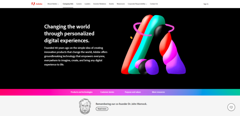 Screenshot from Adobe, February 2024
Adobe focuses on the future with its About Us page, showcasing how this 40-year-old organization is innovating with AI-driven solutions for creative teams, data analysts, and marketers.
A memorial for its co-founder, John Warnock, demonstrates care for the company’s legacy and showcases how this culture of innovation started with a glimpse into the inventor of the PDF format.
Following a breakdown of its products, Adobe shares case studies of household names like Coca-Cola and BMW before succinctly presenting its purpose and values.
Packed with color, Adobe’s About Us page is engaging and clear in its value for the community of creative users and clients.
3. Animal Rescue League of Boston
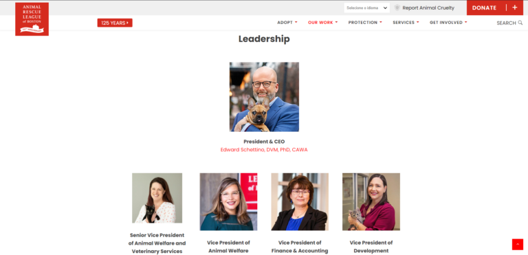 Screenshot from Animal Rescue League of Boston, February 2024
The Animal Rescue League of Boston (ARL) boasts a rich history. It was founded back in 1899 by Anna Harris Smith, a social worker who wished to combat the mistreatment of horses and the sheer volume of stray dogs and cats in the city.
ARL does a terrific job of sharing its 125-year history of support for animals on its About Us page, which is rich with photo collections from the past to the present.
The links to assets invite the user to learn more about ARL’s cause. For instance, the impact report is a one-pager that proves its support for over 20,000 animals in Massachusetts alone. At the end of the page, leadership photos featuring pets are a nice touch to reinforce ARL’s commitment to helping animals.
This About Us page is an example of how to show front-and-center your mission and pluck the heartstrings of your audience with just the right content.
4. Arctic Wolf
 Screenshot from Arctic Wolf, February 2024
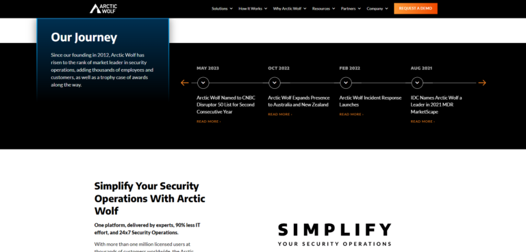
With a bold claim to “end cybersecurity risk,” Arctic Wolf uses metaphors and analogies with its canine namesake to invite you to join its pack, see its “pack impact” (corporate social responsibility), and even includes howls in its videos.
Arctic Wolf embraces fun while demonstrating authority, featuring its timeline of achievements since its founding in 2012, as well as its penetration in the sector by processing over 3 trillion security events per week for over 5,000 customers with 411% ROI.
This About Us page exemplifies that a fun touch to B2B branding is possible while reinforcing confidence among key buyers.
5. Born2Bond By Bostik
 Screenshot from Born2Bond By Bostik, February 2024
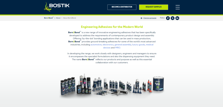
Adhesives leader Bostik has a dedicated website for its new Born2Bond products, which also has an About Us page for describing its unique benefits.
By linking to unique pages per industry, Bostik allows users to learn more about their demands while keeping the About Us page compact and focused on its core messaging: adhesives for a modern world.
With clever use of brand colors, the Born2Bond product line makes a strong impression in an example of an About Us page, which is compact yet effective for demonstrating the benefits of new solutions.
6. Brand USA
 Screenshot from Brand USA, February 2024
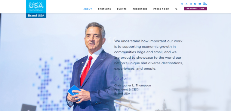
Brand USA, the organization tasked with encouraging foreign tourism to the U.S., features an About Us page that serves as a hub for discovering its team, downloading toolkits, and reading reports.
It is an example of an About Us page that covers all bases yet does not feel cluttered or confusing; the copy and navigation are clear, as is the value of Brand USA to the country’s economy and growth.
The CEO’s message at the beginning of the About Us page demonstrates its commitment to fostering economic growth. It establishes a meaningful connection with both tourists and businesses within the industry.
7. Brightcove
 Screenshot from Brightcove, February 2024
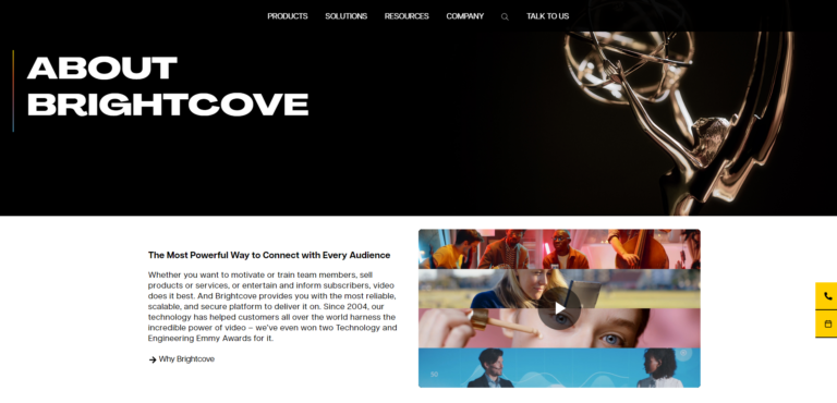
Video has increasingly become a key format in the past years for B2B marketing, and streaming technology platform Brightcove showcases credibility right at the start with an Emmy on its About Us page.
The messaging is short, featuring only a paragraph of copy and a video, yet it speaks volumes for the user to understand that they are a leader in business streaming and in navigating all its complexities.
By keeping it short and sweet with an “Explore more” section, client logos, CTAs, and a search bar, this About Us page conveys its message swiftly.
8. Connected Nation
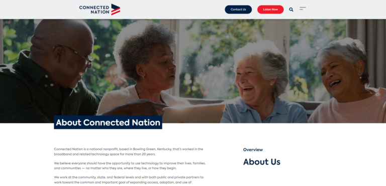 Screenshot from Connected Nation, February 2024
Connected Nation’s About Us page is an example of how to promote consistent messaging across headers, CTAs, and minor elements on a web page.
The goal of this non-profit is to improve access to high-speed internet across the U.S., which is presented with the slogan “close the digital divide” in the second header and first CTA, as well as in its mission and video celebrating 20 years of work.
The About Us page also ensures that the reader understands the key role of this non-profit through succinct copy about what the company does and believes in, as well as a glossary that clarifies internet jargon such as “fiber” and “backbone” for less tech-savvy audiences.
9. Deputy
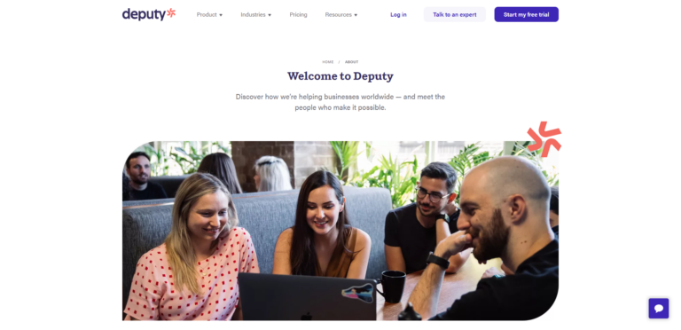 Screenshot from Deputy, February 2024
Deputy reveals its personality and friendly tone i this About Us page, which opens with a “welcome” and ends with “let’s get social.”
The copy reinforces its unique benefits as a staffing solution, evidenced by its values such as “Clock in for the customer” and “Own your shift.”
The timeline begins with a classic yet engaging startup story, recounting how the founder discovered a solution to their problem with staffing admin and developed an in-house platform.
Years later, this platform would be shared with the world, leading to over 320k companies now using Deputy.
It is a great example of an About Us page for SaaS, startups, and organizations in the tech space.
10. Gartner
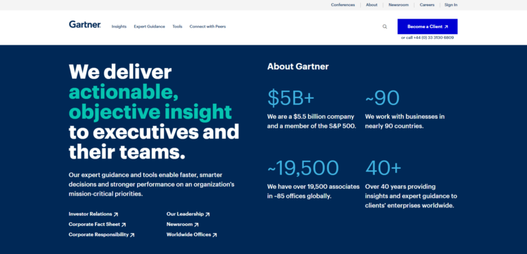 Screenshot from Gartner, February 2024
This About Us page is packed with copy, yet it avoids overwhelming users by highlighting key figures and the value of Gartner’s experts for B2B organizations.
With 40 years of experience across 90 countries, it offers compelling social proof at the top right of the page – a prime location according to heatmap research.
The page offers tabs to discover the brand’s experts, consulting, tools, and benchmarks, concluding with the “Life at Gartner” section focused on team stories. Featuring crisp visuals and concise copy, it facilitates scrolling.
Overall, Gartner makes smart use of prime real estate on its About Us page with data points, using it as a hook to encourage discovery of the more traditional, institutional pages.
Anyone who wishes to showcase their data front and center should emulate this approach.
11. GoTo
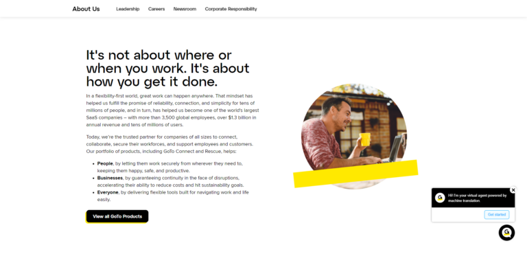 Screenshot from GoTo, February 2024
Splashes of yellow and blue make this About Us page eye-catching and friendly, which is a key selling point of GoTo for its audiences.
The company is all about making people’s work easier through its communication and IT solutions.
Product copy reinforces this friendly tone, with the audiences broken down into “people,” “businesses,” and “everyone,” which invite the user to discover its product suite with a CTA.
GoTo demonstrates how to create an approachable About Us page that is free of industry jargon, which is key when your audiences have varying knowledge levels.
12. Google
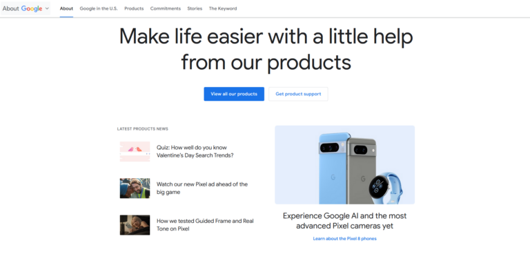 Screenshot from Google, February 2024
As a household name, Google focuses on its cultural impact to engage readers on its About Us page, which is dynamically updated with new content (the section at the bottom is updated with its daily doodle).
For example, when I began writing this article (January 2024), the page highlighted its 25 Years In Search video. Only a week later, it switched to a Doodle contest for children to earn scholarships and tech for schools.
Google wraps up the page with case studies of people utilizing its tech for the betterment of its communities, furthering its already evident corporate social responsibility and global impact.
It is a fine example of an About Us page that showcases the benefits of its products while inspiring a sense of community among users.
13. Helmsley Charitable Trust
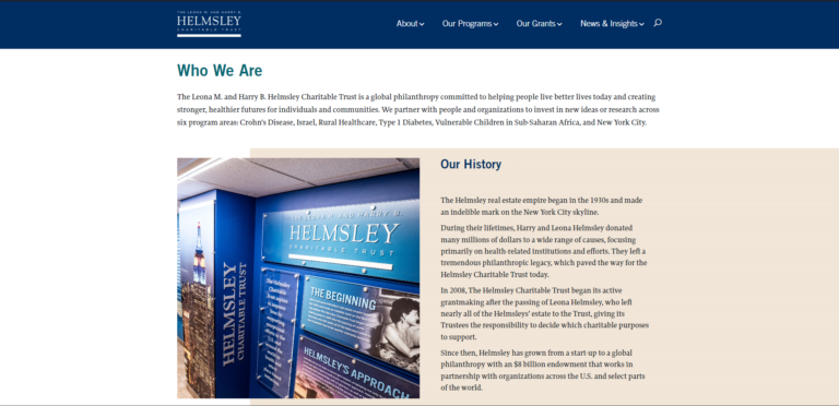 Screenshot from Helmsley Charitable Trust, February 2024
As a philanthropic institution, the Helmsley Charitable Trust strives to showcase the value of its work. This About Us page excels at proving that with clear financials and balance sheets, as well as bios of its trustees in initiatives such as diabetes and access to healthcare.
The history of the charitable trust unveils the institution’s long legacy as a startup, initially founded with resources from the philanthropic Helmsley couple in the 1930s.
The narrative is compelling, illustrating how multiple generations have benefitted from the trust’s positive impact.
Overall, this is a definitive example of an About Us page for any institution that wishes to convey its legacy and core goals in a trustworthy manner.
14. Insight
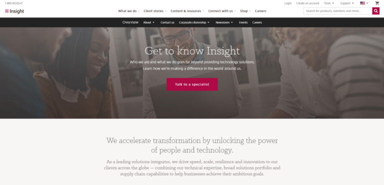 Screenshot from Insight, March 2024
This technology solutions provider conveys transparency and a strong company culture on this About Us page. It also links to other webpages, delving into its entrepreneurial start in 1988, its company values, and awards.
As a Fortune 500 leader, this is an excellent example of an About Us page that highlights the community and mission of a global brand to drive a positive impression of its solutions.
Users can download Insight’s Corporate Citizenship Report, which demonstrates its commitment to the United Nations’ Global Compact and spotlights client stories of technology improving healthcare and achieving sustainability.
15. Iron Mountain
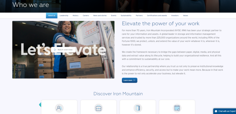 Screenshot from Iron Mountain, February 2024
A leader in asset management and digital transformation, Iron Mountain leans heavily on its 70-year legacy (curiously starting with a mushroom farm) and its “Elevate your work” messaging.
This About Us page cleverly uses cards to facilitate navigation to its institutional pages and adds copy as needed to demonstrate credibility, such as serving 95% of the Fortune 1,000.
The message in the featured video focuses on the end goal achieved through Iron Mountain products – companies hire data and asset management services to better serve their customers, which adds familiarity to its solutions in a sector that is usually awash with jargon.
Overall, this is a fine example of an About Us page that celebrates an organization’s legacy (without being verbose) while keeping a clear eye on the future and all its possibilities.
16. MeanPug
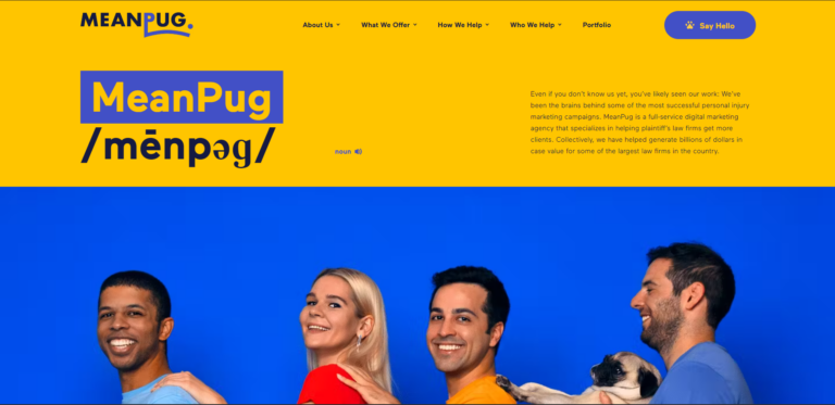 Screenshot from MeanPug, February 2024
MeanPug bets on a colorful and fun About Us page to grab attention for its marketing agency for law firms, which serves as a counterbalance in a space where most agencies adopt a serious tone.
The fun starts with an audio track of MeanPug’s name pronounced with barks, followed by colorful headers and artsy team bios (the pug itself is CPO, Chief Pug Officer).
The company then proves it delivers more than just fun with its results, evidenced by growing law firms from $0 to $100m ARR in under 3 years and even helping to quadruple clients’ digital sales.
17. Oracle
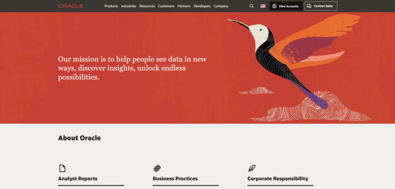 Screenshot from Oracle, February 2024
Since 1977, Oracle has significantly influenced the state of the tech industry.
With a remarkable legacy of accomplishments, such as pioneering the SQL database, Oracle encapsulates this history into a concise timeline and links to other institutional pages for more information.
By focusing on its mission, Oracle encourages users to navigate as they see fit through its analyst reports, CSR, leaders, and investor relations.
Interestingly, Oracle does not feature its products on its About Us page, focusing instead on its corporate initiatives. It is a superb example of a simple page that effectively conveys trust and encourages engagement.
18. OutSystems
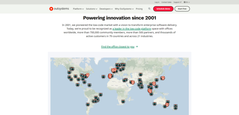 Screenshot from OutSystems, February 2024
Low-code platform OutSystems focuses on the basics in this About Us page – its locations, history, social proof, investors, and leaders – and does so in a way that quickly demonstrates the value of its solutions.
By linking as needed to other pages across its website, OutSystems demonstrates how to build an About Us page that is simple yet compelling and invites the user to stay and learn more.
19. Salesforce
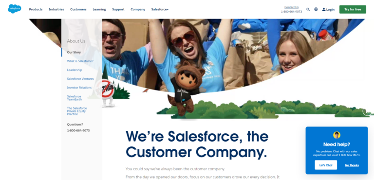 Screenshot from Salesforce, February 2024
A SaaS pioneer, Salesforce relies on its strong culture and history to position itself as a customer-first, “customer company.”
That message is delivered clearly with its branding and copy, from the product names to the mascots and videos that explore its legacy and CSR efforts.
This About Us page tells a complete story, beginning with the challenge to meet evolving consumer needs, then the solution of building a “bridge” to meet those needs, and concluding with its core values and culture.
At the end, the CTA asks if the user has any questions about getting on “the right path” with Salesforce.
In short, this is how a company with a rich culture and community should build an About Us page that delivers credibility in a fresh way.
20. ServiceNow
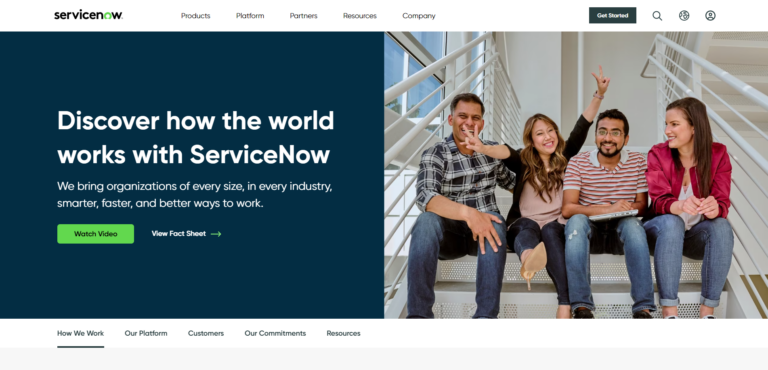 Screenshot from ServiceNow, February 2024
ServiceNow leverages its tagline “when X works, the world works” to demonstrate its versatility as a data and digitization platform for empowering several industries, such as healthcare, retail, and manufacturing.
By linking to fact sheets, its code of ethics, and investor relations, ServiceNow goes beyond what is usually found on an About Us page to demonstrate credibility and penetration in the market (85% of Fortune 500 companies use ServiceNow).
This is an About Us page that excels at driving a core message and intuitively linking to multiple, often complex, resources.
21. Sony Interactive
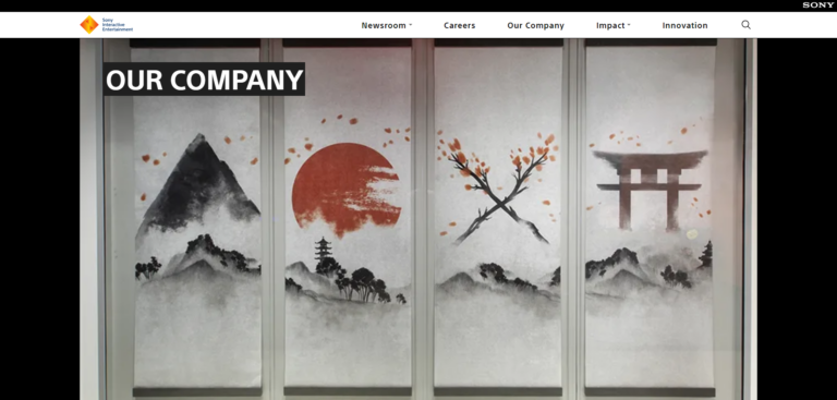 Screenshot from Sony Interactive, February 2024
Sony Interactive leverages its strong gaming community and legacy in this About Us page, featuring a product timeline with console blueprints and “fast facts” that swiftly present impressive sales numbers.
The layout is seamless and presents a myriad of institutional elements, such as its mission and global presence, in a manner that encourages further navigation.
This is evidenced by its placement of sister pages just before the footer, which includes the blog, studio, product, and corporation pages.
22. Splunk
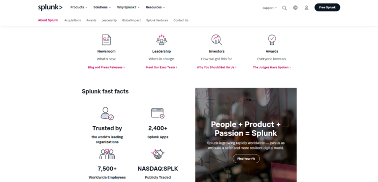 Screenshot from Splunk, February 2024
Splunk focuses on simplicity for its About Us page but adds elements like an interactive infographic and a video to highlight the brand’s scope and community impact.
A fast facts section proves Splunk’s value at a glance, where the user is encouraged to explore further through CTAs for the company’s pledge, newsroom, and more.
Overall, this About Us page serves as a high-impact template for any business that wishes its audience to perceive its products holistically and view their broader social impact.
23. Tealium
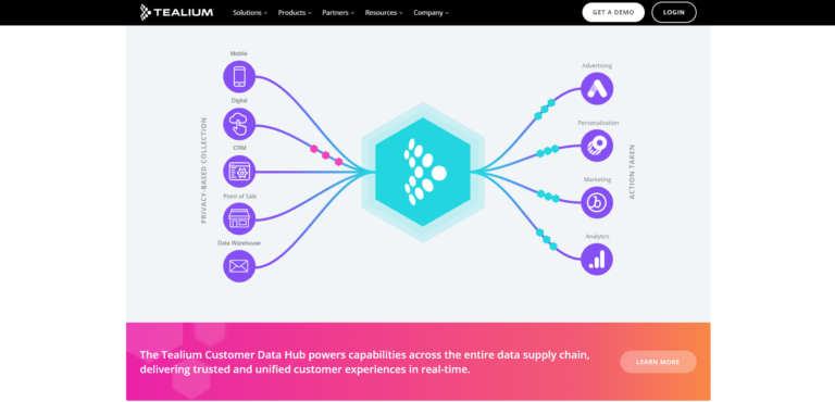 Screenshot from Tealium, February 2024
The highlight of Tealium’s About Us page is the animated infographic of its customer data platform and how its privacy-based collection across channels results in quicker insights, ROI, and engagement.
This page’s social proof is strong. The data platform’s privacy compliance is guaranteed by ISO and institutional standards, as reinforced by accolades and case studies.
In short, this is an example of how to tell a story with an engaging element (in this case, an infographic) and use it as a foundation for driving your brand narrative.
24. Twogether
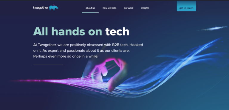 Screenshot from Twogether, February 2024
Twogether weaves in its personality in every word on its About Us page, without buzzwords or fluff and supported by strong imagery and core values.
By summarizing its values in the five P’s (Purpose, People, Passion, Performance, Planet), Twogether showcases how its mission and results to clients are unique as a dedicated B2B tech agency.
Its supported charities not only act as case studies but also prove the organization’s values. Then, the brand follows up with links to discover Twogether’s services and goals.
This is an About Us page example for any agency seeking to stand out with an unmatched personality.
25. Upwork
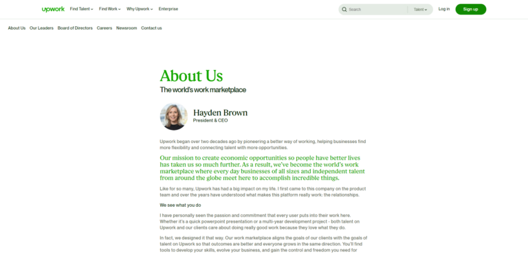 Screenshot from Upwork, February 2024
Upwork employs a letter from the CEO for this About Us page, which is effective in addressing both of its audiences: organizations seeking high-quality freelance help for their projects and freelancers seeking opportunities to advance their careers and earn income.
It is succinct yet detailed enough to showcase the platform’s value. The top navigation lets users learn more about Upwork’s leaders and its latest news.
If you wish to position an executive of your organization as a thought leader, adopting this approach could be beneficial by showcasing their voice on a key page.
How To Write An About Us Page To Connect With Your Audience
Connecting with your audience with an About Us page is about authenticity and driving your brand message in an engaging manner, which encourages navigation to other elements of your website.
As can be seen from these 25 About Us page examples, all excel in showcasing their mission, what is unique about their brand or products, and inviting the user to take action.
The key is to do so in a creative way that encourages conversions.
Therefore, if you want to connect with your audience through an About Us page, I would recommend:
- Keep it short and sweet: Focus on the basics–mission, values, and solutions. Then, think of the best way to showcase those elements swiftly to encourage engagement.
- Add a creative element: Be it a video, infographic, moving image, or an audio track, many examples of About Us pages in this article leverage unique formats to engage users.
- Make it fun: Do not be afraid to make your About Us page fun, as it can grab immediate user attention. You can follow up with data and social proof to convey credibility.
- Structure it as a hub: Rather than clutter your About Us page with copy and products, use it to link out to assets as needed to engage your audiences and prove your value.
Final Takeaways
After analyzing the 25 About Us page examples in this article in detail, here are the final takeaways to keep in mind when crafting yours:
Creativity Makes Your Page Stand Out
For many companies, the About Us page is a formality to fill in the sitemap rather than convey a unique message.
However, many brands go beyond this, designing rich web pages and writing copy that stands out from the competition. Find your unique angle and be true to your story.
Feature The People Behind The Brand
Whether you are a solopreneur, a dynamic duo agency, or a full-blown global enterprise with thousands of team members, letting people shine makes an engaging About Us page.
Many of the examples in this article feature headshots and graphics packed with personality, which convey brand values better than words.
Tie In Social Proof With Your Corporate Social Responsibility
Showcase results and convey the difference your organization is bringing to the world.
6sense and Salesforce are two examples from this article that feature how their products are changing their communities for the better.
How are you changing yours?
More resources:
Featured Image: Naumova Marina/Shutterstock


