Creating a winning online course landing page is no simple feat. It takes planning, customer insight, design skills, powerful and persuasive copy, and believable testimonials. While this is not an exhaustive list of all you’ll need, it’s a great starting point. In this blog post, we’re taking a look at 12 of the best online course landing pages we found on the web. As you’ll see, each comes with a unique design and a collection of other smart elements. Together, these elements form effective landing pages. If you are looking for ideas to help you create your winning online course landing page, keep reading.
12 Best Online Course Landing Pages:
Our collection of landing pages include key components to pay attention to. We’ll look at the power of design, color, persuasive copy, customer insights, psychological triggers, video, and more. Through our analysis of elements, you’ll get a better look at the most effective components that go into creating winning landing pages. Let’s get started!
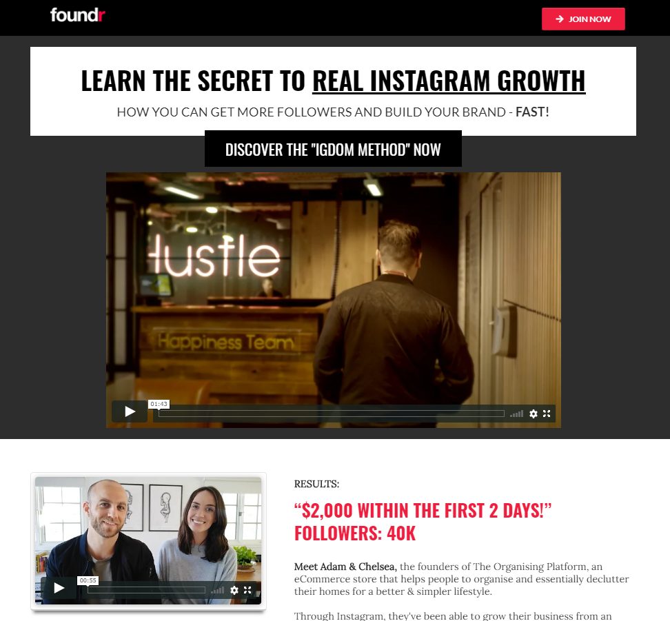
Foundr Is an entrepreneurship magazine and has been around since 2012. While wildly successful today, when the brand launched, like all new endeavors, it took a while to grow. And that’s one of two reasons why this online course landing page is so unique. Instagram Domination is a product of founder Nathan Chan’s experience. The course is packed with actual steps to follow for any brand looking to grow on Instagram.
Secondly, we love this landing page because of the effective use of color, testimonials and social proof. As soon as you visit the page you are greeted by a large white banner with powerful copy that draws you in. Color is extremely important as a design element and Foundr does an excellent job of making the most important elements of their landing page pop using contrast. From the background to the call to action buttons, readers quickly identify all elements that matter on the page, making it easier to know what to do next.
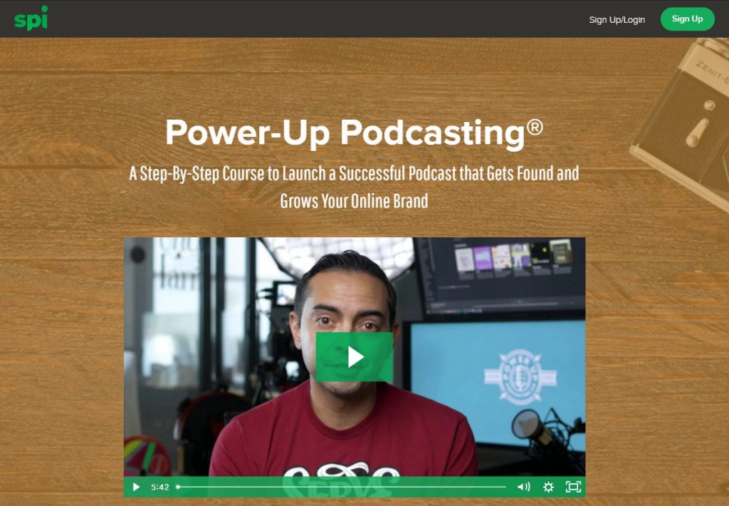
Pat Flynn is one of the most recognized online entrepreneurs in the world today. He started his business back in the 2008 recession, after being let go from his architectural job. Since then, he’s been launching amazing products, like this one. Power-Up Podcasting is a clear example of what sets him apart from other online entrepreneurs. Flynn understands the power of video. And as you load his online course landing page, it’s the first thing you’re greeted by.
Flynn’s video is five minutes and 42 seconds long. In it, he explains why podcasting is a crucial part of running an online brand the benefits it brings. The video also touches on updates to the course to make it more valuable, and that it helped thousands of entrepreneurs launch successful podcasts, too. And if that wasn’t enough, it also includes powerful video testimonials.
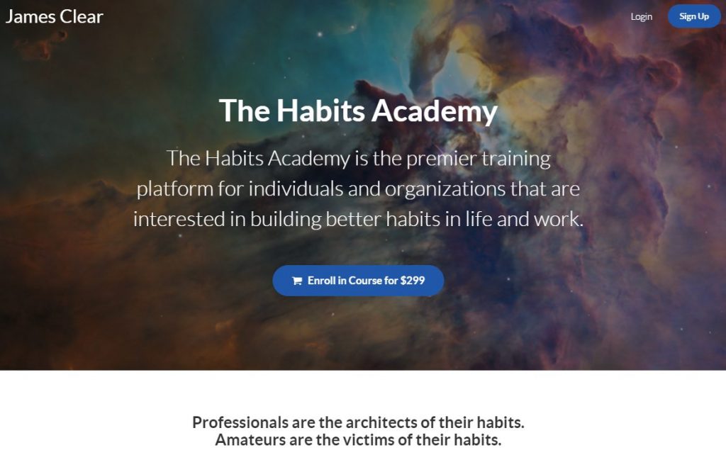
The Habits Academy was founded by James clear. Clear is known for his study of habits and the science behind developing the right ones to propel you toward success. The Habit Academy online course landing page includes a powerful message that takes readers on a journey. Clear asks the reader to imagine two versions of themselves, five years into the future. He then begins to paint a picture of what a life filled with positive and effective habits would look like. Next, he juxtaposes a bright future alongside a life without good habits. And this is what makes for powerful copywriting. In under a minute, readers immediately experience a call to action to become the best selves. Clear uses powerful psychological triggers in a positive way, appealing to vanity and a strong desire for self-actualization.
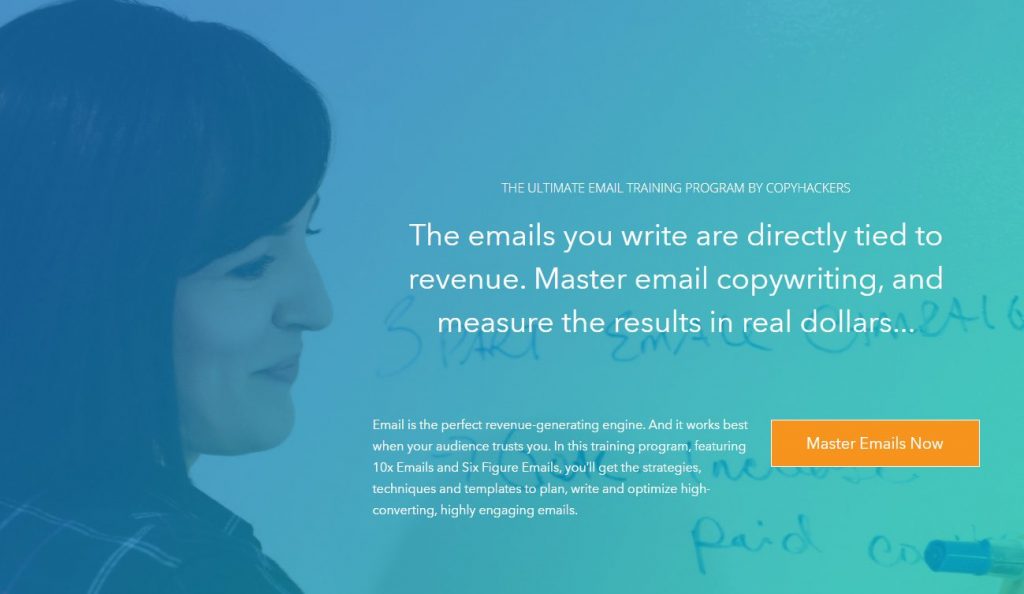
Joanna Wiebe is a well-known copywriter and copywriting coach. On her landing page she sells a simple but big idea: mastering email copywriting and learning how to measure your results in revenue is possible. This matters to any business owner who is looking for ways to grow their bottom line. Wiebe’s artfully identified one of the key drivers that most struggling with email marketing encounter. By zeroing in on the idea that email marketing is somehow unclear or hard to do, she’s flipped that notion and made it possible to think of yourself as a master email copywriter that turns words into dollars.
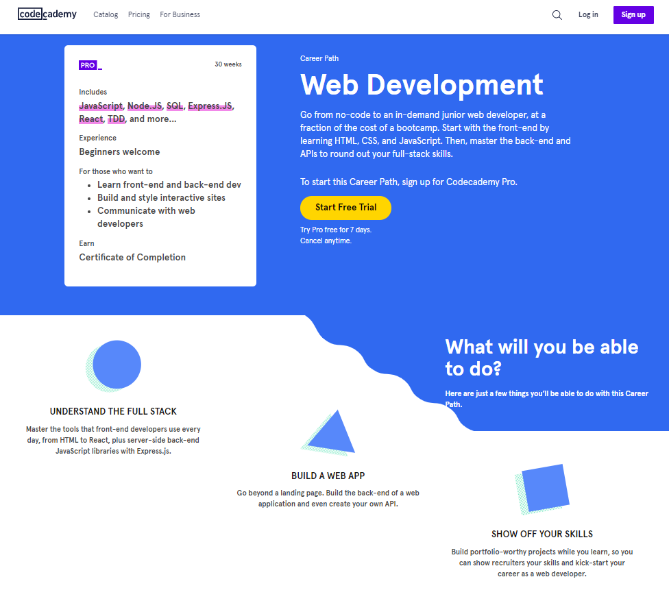
Code Academy is a popular online coding learning platform. The online course landing page for their web development program does an excellent job of identifying the most important elements of interest for prospective students. For example, take the big white box to the left that is a summary of what you get. It details the coding languages you’ll learn, looks at the experience you need to get started, what you will do in the course, and that your reward of the certificate of completion. This landing page also catches the eye with a combination of well-placed graphics and microcopy below the header. These immediately draw attention and reinforce the most important aspects learners will benefit from.
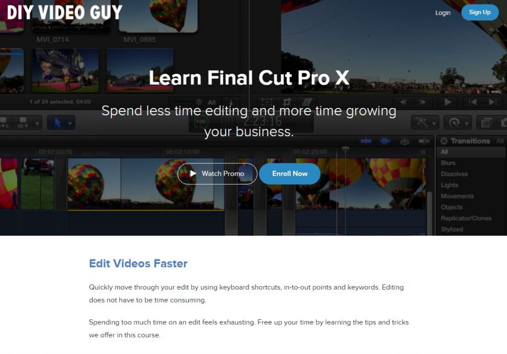
Videography is a booming industry, one with lower barriers to entry than ever before. But just because anyone can pick up the camera and start recording, that doesn’t mean they’re product will be polished or perfect. Caleb Wojcik knows this and created an online course to help videographers turn their raw video into works of art. This message shines through in the header of his online course landing page. He sells the major benefit that his course will help you spend less time editing and more time growing your videography business.
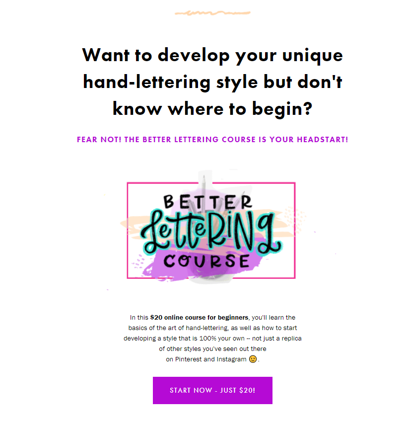
Hand-lettering, despite how complicated it sounds, is actually within reach. Better Lettering Course’s landing page quickly makes you believe that you can, for as little as $20, begin your path to becoming a hand-lettering success. What makes this landing page powerful is the simple design coupled with messaging that’s empowering and strategically placed just above the buy button. This course is designed to help you develop your own unique style of hand-lettering.
And if you somehow managed to get past the first section without committing to the course, this landing page gives a breakdown of the number of lessons and what you learn in each. You also get to see a summary of what comes with the purchase, but that’s not all. You’ll find a collection of work produced by students in a student gallery. The best part? The gallery acts as a motivational tool for prospects wondering what success looks like once done with the course.
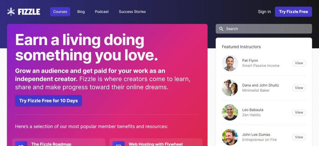
Fizzle is an online membership platform that’s filled with tons of valuable courses on how to start and grow an online business. Their landing page embodies some of the most powerful elements that are a testament to the brand’s success. Not only has Fizzle used color and contrast effectively, and nailed the right tone and voice of their audience, their copy is inspiring and aspirational. It appeals to a sense of self-actualization and this runs through their landing page right down to their buy buttons which use custom text that nudge prospects to join. And did you see it? Their button text comes with a unique offer to try their platform for just one dollar and the option of canceling at any time.
Another critical component of this course landing page is the educational element. Fizzle knows its audience well enough to understand that entrepreneurs have tons of questions about starting a business and want to sap up as much information as they can. To help, they created an entire section called, “So what makes building a business such a challenge?” In it, the brand answers the question by introducing traits that all successful businesses and entrepreneurs embody. The section speaks about tenacity, ideas, the importance of execution, and why support and access to the right people, tools and knowledge is essential.
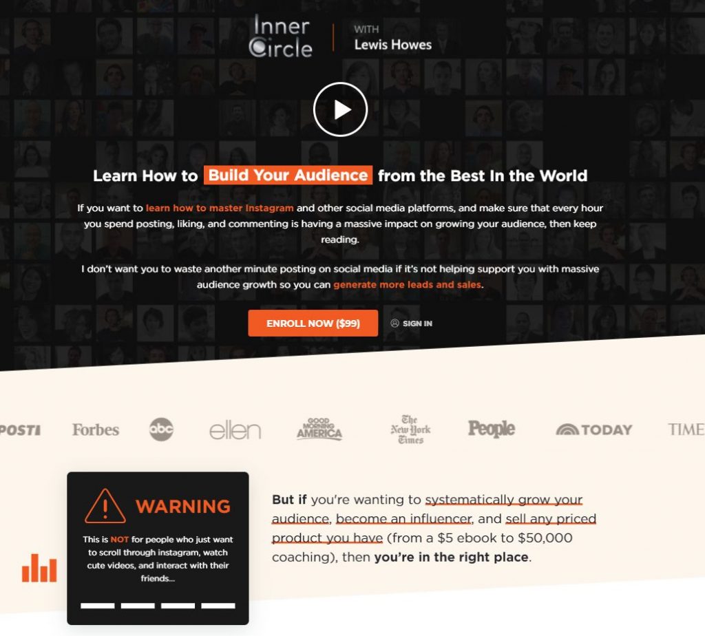
One of the more important elements of creating an effective landing page is including social proof. Lewis Howes has been smart about the ways he has leveraged social proof. Howes showcases appearances on various shows from Ellen, Good Morning America, and The Today Show, to featuring and prestigious publications like Forbes, the New York Times, and Time Magazine. When it comes to using these important symbols of authority, Howes has strategically placed them just below the header of his course sales page. Seeing these immediately elevates the value of the course, showing that ideas in the course and it’s creator are viewed as credible by authorities, making you instantly appreciate that you’re getting value for money.
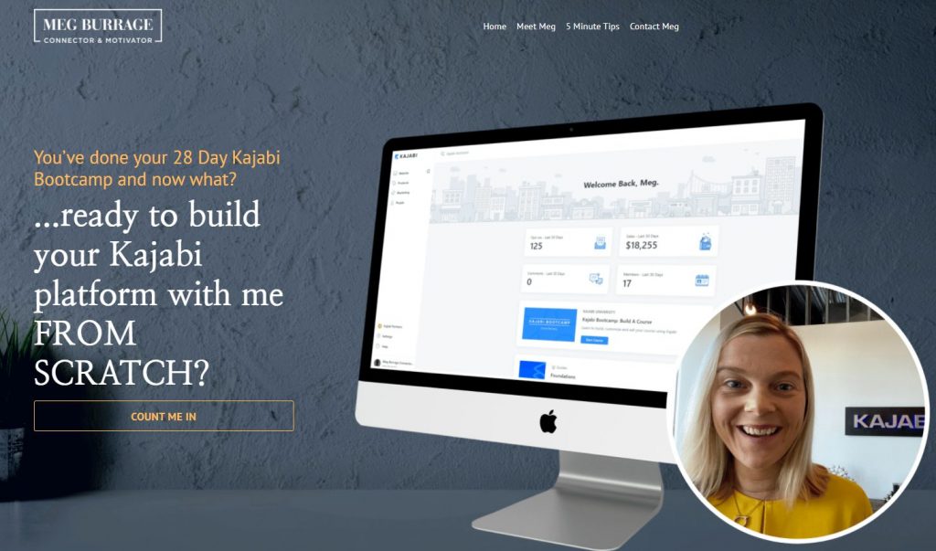
Kajabi is one of the most well-known and successful online course platforms available today. It’s filled with tons of features and functionality to help you build and market your most successful online course possible. But there is one catch, building a course on Kajabi’s platform can be a little complex. Meg Burrage identified this problem and created an online course for all Kajabi customers who have been through the platform’s 28-day bootcamp, but still feel overwhelmed. Selling the idea of success to people who really feel like they’ve somewhat failed is no easy feat. But Burrage distills her message and gets it across effectively.
She empathizes with her audience, gives them options they can choose from, none of which are very unfavorable, or they can take her course and build the course of their dreams.
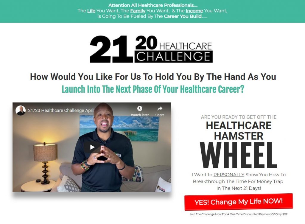
It’s no secret that most online courses are designed to address a very specific problem. The problem is usually a pain point that prevents people from achieving a certain level of success. For health professionals, plotting their next career move is exactly what Greg Todd wants to help with. Beyond the use of a killer header, video, and a powerful call to action, Todd does something to help prospects qualify themselves. In a section titled, “if you’re not sure if the 21/20 challenges for you” readers get to check themselves by asking critical questions that lead to a “yes”. And just below these important questions is a larger animated button with custom text that begs action.
Todd’s online course landing page also includes a sneak peek of what the program comes with. He offers a large and clear image of course videos followed by bullet points that cover details and bonuses (along with their dollar value).
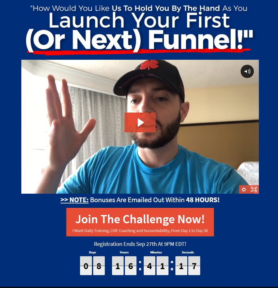
Building an online marketing and sales funnel isn’t easy, but it is doable. The challenge most people face when taking on the task is not knowing where to start, how each piece of the puzzle fits together, and what to do when they reach a roadblock. The One Funnel Away Challenge does away with the complexities, fear, uncertainty, and doubt. Unlike most videos we’ve seen on online course pages, this one is different. In the video, Stephen Larson immediately starts talking to you as if you’re in the same room. His message flows as he explains that he will be your guide on a daily basis. He shares that he has helped 7500 students to date, and that he co-created the course. But because we know building an online marketing funnel is no simple feat, Larson also identifies the common pitfalls students experience. And that’s gold. Offering that much transparency clearly shows viewers that the value they receive in the course far exceeds what they may have initially expected.
Transparency established, Larson then touches on some of the key elements of launching your first or next funnel. He mentions resources that are shipped to you and introduces other experts that will be helping you. Just when you think you can get any more personable, Larson empathizes and also shares his personal story about 17 failures before he was able to launch a successful funnel. Watching this video is more than enough to convince anyone seriously considering creating a funnel to take action.
Your Turn
Creating your winning online course landing page is a major step in the direction of accomplishing your personal goal. While it’s all about getting your personal brand out there and generating revenue, you have to do it right. Take the time to examine these landing pages and any others you come across that hold or offer something special. Pay attention to design, landing page copy and messaging, and how everything comes together to work as an effective sales tool.
About the Author
![]()
Writer
Nadica Naceva, Head of Content at Influencer Marketing Hub, is a seasoned writer and reviewer with in-depth expertise in digital and content marketing. Leveraging her extensive experience in guiding content creation and strategic direction, Nadica brings a critical eye and analytical approach to reviewing articles and educational pieces. Her commitment to accuracy, integrity, and innovation with each review helps IMH grow as a leading source in influencer marketing. Her insights are backed by first-party data, ensuring content meets the highest standards of relevance.

![🎬 [$30 Special] Create buyer-getting social media stories – FAST! 🎬 [$30 Special] Create buyer-getting social media stories – FAST!](https://virtual-coach.com/wp-content/uploads/2016/06/car1-e1466681378607.jpg)


