

It has barely been a day since the Meta-owned platform unveiled its first wordmark update in nearly a decade, but the redesign has already triggered a wave of mixed reactions online. While in a statement Instagram head Adam Mosseri described the change as an attempt to make the wordmark feel more modern, clean and simple, the internet appears to have had a rather different first impression, with users questioning its legibility and turning the new design into a meme.
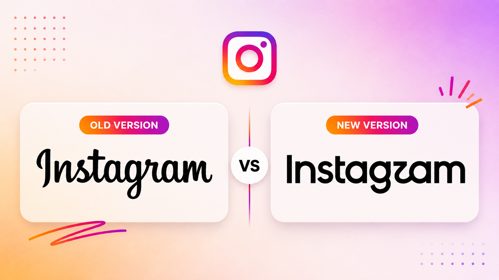
The redesign itself isn’t dramatic on paper. The old, flowing cursive wordmark has given way to a hybrid, part print, part script, with thicker, rounder lettering and a more restrained use of Instagram’s signature gradient. The shift moves the wordmark from its original script-oriented styling toward a hybrid design that blends script and print lettering. The camera icon everyone recognises stays exactly as it is; only the text logo has changed.
But reportedly, reactions split sharply within hours of the announcement, generating more than 5,000 combined replies across Mosseri’s Instagram and Threads posts before the debate had fully taken off. And the criticism converged almost entirely on one detail.
This social-media backlash to the redesign has signalled something worth sitting with: is it a sign that the new identity has missed the mark, or simply the inevitable reaction that comes when a familiar brand changes something consumers have grown used to?
Speaking about what the redesign signals, Mayuri Nikumbh, chief design officer, Elephant, says that purely from a wordmark perspective, her immediate reaction was that it creates a stronger sense of belonging within the Meta universe through its clean lines and almost sans-serif aesthetic, while retaining elements of the earlier cursive logotype to preserve familiarity and distinction in the digital landscape. “At the broader brand system level, however, the narrative is more expansive and inclusive. Instagram is positioning itself as more than a filter-led photo-sharing app, evolving into an ecosystem that enables authenticity, creativity and the creator economy.”
Sridhar Ramanujam, independent communication consultant and former CEO of Integrated Brand-Comm, acknowledges that there are questions around the new logo’s readability, but argues that design remains subjective and that brands should not necessarily over-index on public reactions. More importantly, he believes a logo refresh should ideally reflect a deeper change within the business rather than being a cosmetic exercise. In his view, a redesign makes greater sense when it reflects changes in a company’s offerings, philosophy or areas of focus, giving the new identity a strategic purpose beyond simply looking different.Instagram had not shared an official comment with ET BrandEquity at the time of publication.
“Backlash to a design is actually a way of keeping the design in the mindset of users, current and potential,” says Harish Bijoor, business and brand strategy expert and founder, Harish Bijoor Consults Inc. He believes that while a logo refresh can be risky for brands with strong legacy and memory, Instagram is in a different position. “A logo refresh becomes risky, particularly for a brand with a strong legacy and memory. But for a relatively young brand like Instagram, especially when its existing wordmark is 10 years old, I see zero risk. Its users are constantly in a mode of change, and this brand identity works beautifully across generations.”
If this backlash feels familiar, that’s because it is. This is not the first time Instagram has found itself at the centre of a logo controversy. In 2016, the platform replaced its much-loved retro camera icon with a flat, neon-gradient camera glyph. The redesign was widely mocked at the time, with critics arguing that Instagram had sacrificed the character and nostalgia of its original identity for a trendier, more minimalist look.
A decade later, however, that same logo is arguably one of the most recognisable symbols in social media. The initial backlash faded, while the gradient icon became closely associated with Instagram’s identity. In hindsight, what looked like a risky break from the past turned out to be a defining moment in the brand’s evolution.
But Instagram is hardly alone in discovering that changing a familiar identity can be easier said than done.
Gap, for instance, learnt the lesson rather quickly. In 2010, the fashion retailer abruptly replaced its iconic blue-box logo with a minimalist wordmark. The response was almost immediate, with consumers and designers criticising the change and parodying the new identity online. The company eventually abandoned the redesign and returned to its original logo within days.
Tropicana’s experience was even more consequential. In 2009, the brand replaced its familiar orange-with-a-straw packaging with a more minimalist design. The redesign made the product harder for shoppers to recognise, and after sales reportedly fell sharply, Tropicana reverted to its previous packaging.
Then there are cases where the backlash itself becomes part of the brand story, and sometimes refuses to die.
Take Pepsi for example. Pepsi offers a useful lesson in how a brand can get a redesign wrong, and later get it right. In 2008, its new logo drew criticism for being overly simplistic and moving away from the visual cues consumers associated with the brand. The backlash was amplified by an elaborate design document explaining the thinking behind the identity, which itself became a subject of ridicule.
The brand took a different route in 2023, unveiling its first logo refresh in 14 years. Instead of abandoning its heritage, Pepsi brought back visual cues from its 1970s-90s identity. The redesign was therefore less about breaking with the past and more about using nostalgia to modernise the brand while reflecting its evolving focus on zero-sugar products.
Nikumbh adds that a brand refresh carries risk when it does not address a genuine problem with the existing identity, whether that is an outdated personality, a shift in brand purpose, a new narrative, or a merger or acquisition. “Changing simply for the sake of newness can dilute rather than strengthen the brand,” she says.
The risk, she adds, also depends on the category. Physical brands have more at stake given the scale and cost of changing assets, while digital-first brands such as Instagram have more room to evolve because their audiences are accustomed to constant change. Instagram, she says, has also retained its strongest piece of visual equity, the iconic gradient camera, while using the broader brand system to signal a new direction.
The distinction is important. A redesign does not necessarily have to erase what came before; it can retain the elements consumers already recognise while changing how the brand presents itself. That is perhaps where Pepsi’s contrasting redesign stories become relevant to Instagram’s current situation. The question is not simply whether consumers like the new wordmark, but whether it retains enough of the brand’s existing memory while giving audiences a reason to see it differently.
It is also worth noting that Instagram’s change goes beyond the wordmark. The platform is refreshing its wider visual identity, including its typography and brand system, with typefaces such as Instagram Sans, Instagram Pen and Instagram Mono, alongside updated icons and formats. The wordmark is therefore only one part of a broader attempt to evolve how the brand looks and feels.
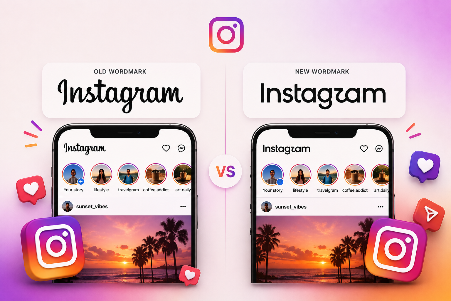
And for what it’s worth, not everyone dislikes it. Alongside the jokes runs a quieter, steadier current of users who find the new look fresher, more contemporary, and are happy to judge the typeface on its own terms.
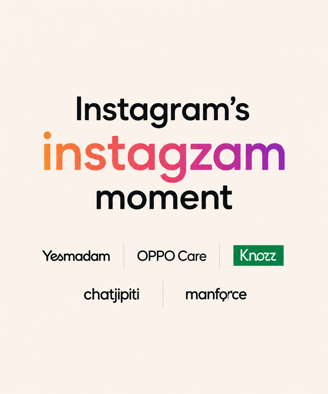
The real test for Instagram’s wordmark won’t be today’s meme cycle, it will be whether, a year from now, anyone still notices the change at all. For now, though, the internet has spoken. And for one brief, ridiculous moment, it has decided that one of the world’s most recognisable digital brands looks like it might be called “Instagzam.”